
SEE THE PROCESS
AND FAN INFLUENCE
Find out about the eight-month journey that we have been on to reimagine Peterborough United’s new crest.

NOW THAT'S COMMITMENT!
Posh fan and presenter of Up The Poshcast Derek Meakins gets a tattoo of the new Posh identity.

HEAR FROM DARRAGH ON THE
IMPACT OF THE NEW IDENTITY
Find out the thoughts of our Chairman, Darragh MacAnthony, and the expected impact that this new identity will have on the Football Club.
The process and
fan influence
This has been an eight-month process in which we have actively sought feedback from our loyal supporters.
Since the announcement of this project, we have listened to our supporters by hosting an in-person fans forum, published fan surveys, received thousands of responses, and conducted many fan focus groups to gather feedback and learn about the designs.
Our loyal supporters have been at the forefront of this project and have played a vital part in the process. We thank all who participated.

ANNOUNCEMENT / SUPPORTER SURVEY LAUNCH
We announced the project.
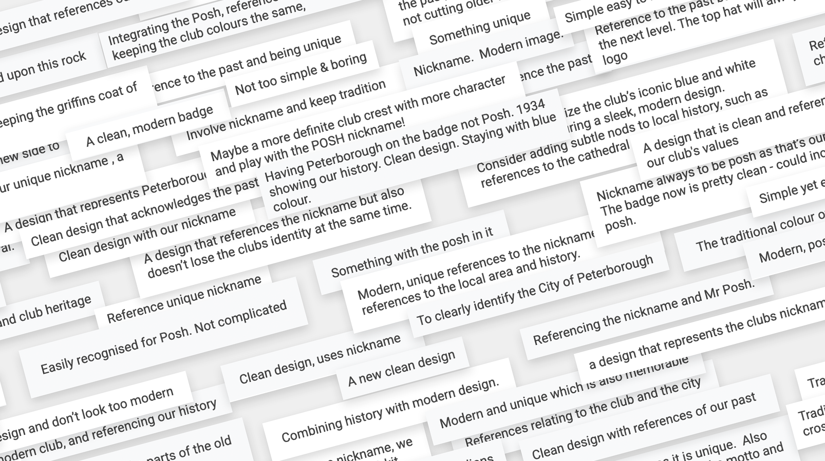
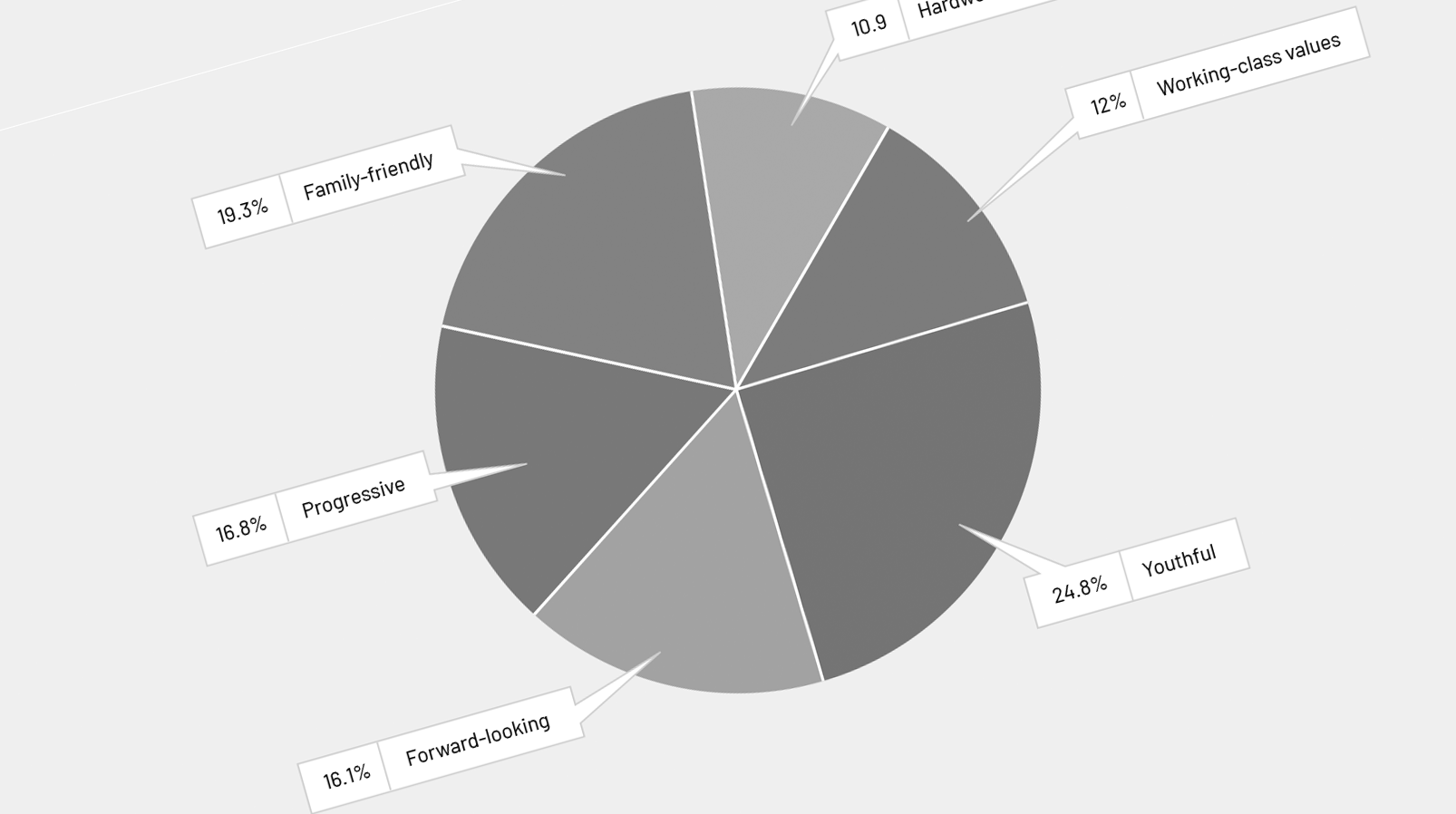
Working with Football Brand Designer Christopher Payne, we released a survey open to all fans, asking what is important to you in a Football Club’s identity.

WE READ THROUGH ALL SURVEY ANSWERS
We received thousands of answers from supporters of all ages. We read through each and every comment, ensuring that the voices and opinions of the fans would inform the new designs.

FAN FORUM - OPEN TO ALL SUPPORTERS
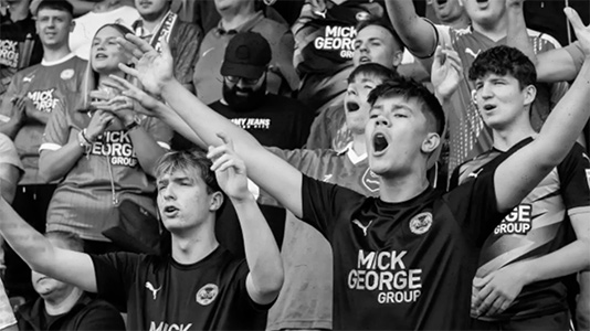
Following the release of the supporter survey, we invited all supporters to a fans forum to talk about our big ideas and to answer your questions.
You told us your thoughts, and we listened.

LOCAL IMMERSION AND RESEARCH
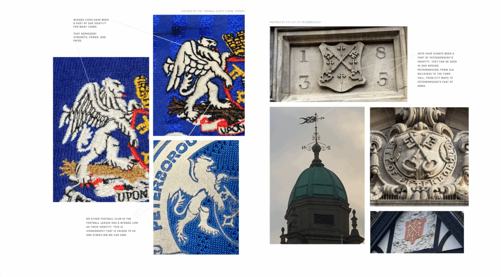
Following the fans forum, Christopher Payne further immersed himself in the local community and explored local symbolism and artefacts from the past,
Payne spoke with Club historians, local legends, and Club leaders.

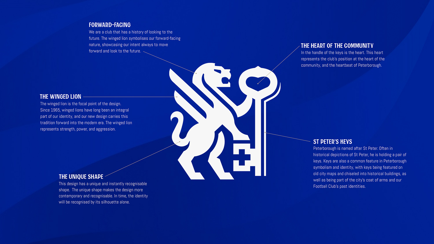
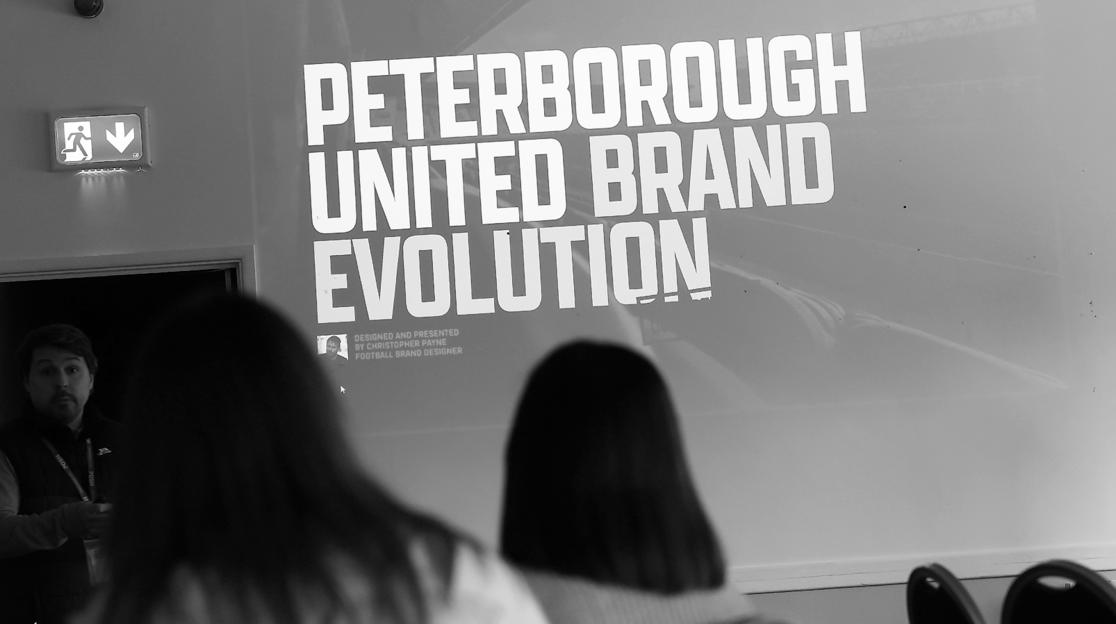
CHRISTOPHER PAYNE WORKS ON NEW DESIGNS
After immersing himself in Peterborough and getting to understand the people, the place, and the vision for the Football Club, he was ready to take on the role. Payne starts the design process, looking to incorporate ideas and feedback from Posh fans.

SECOND SUPPORTER SURVEY PUBLISHED
In March 2025, we published a second survey, asking even more questions about the club's new identity and allowing fans the opportunity to further influence the design.

DESIGNS SHARED WITH CHAIRMAN DARRAGH MACANTHONY
In April 2025, we shared designs with our Chairman Darragh MacAnthony.
Darragh said: "I was pleasantly very excited by it all... I really like it, I think most people will."
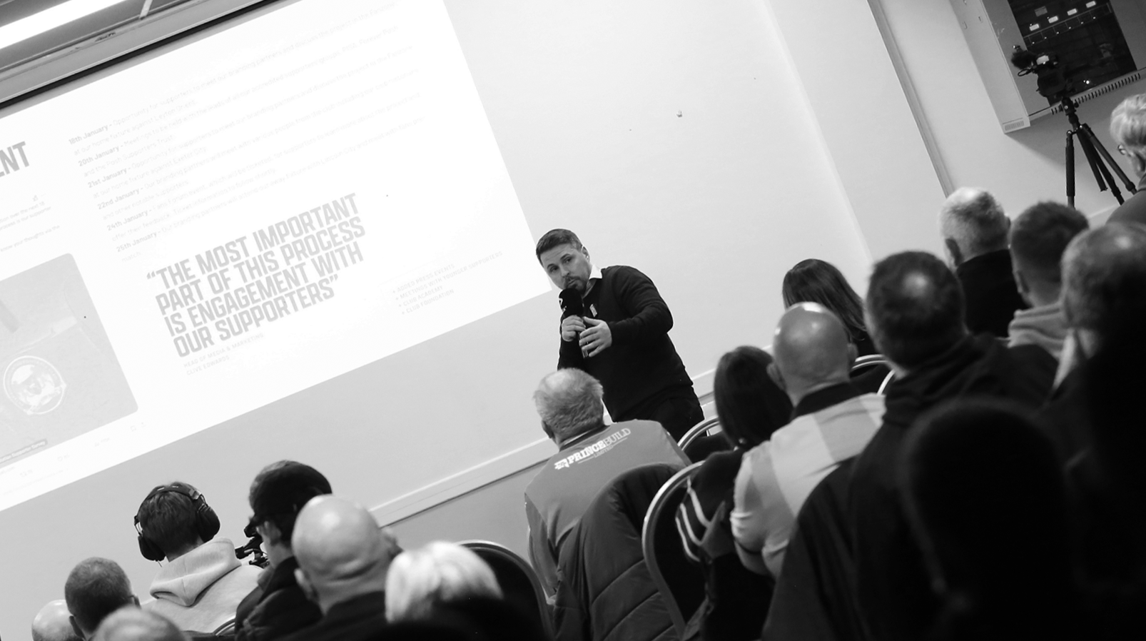
FAN FOCUS GROUPS
In May 2025, we announced fan focus groups, open to all supporters who signed up.
We presented the new design to multiple groups of fans, answering questions and sharing insight on the design.
Almost 100% of attendees approved of the new design.
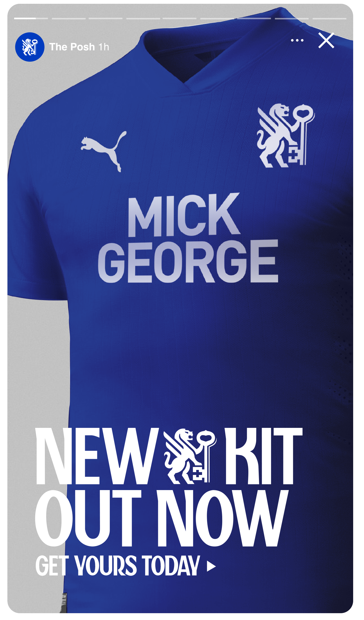
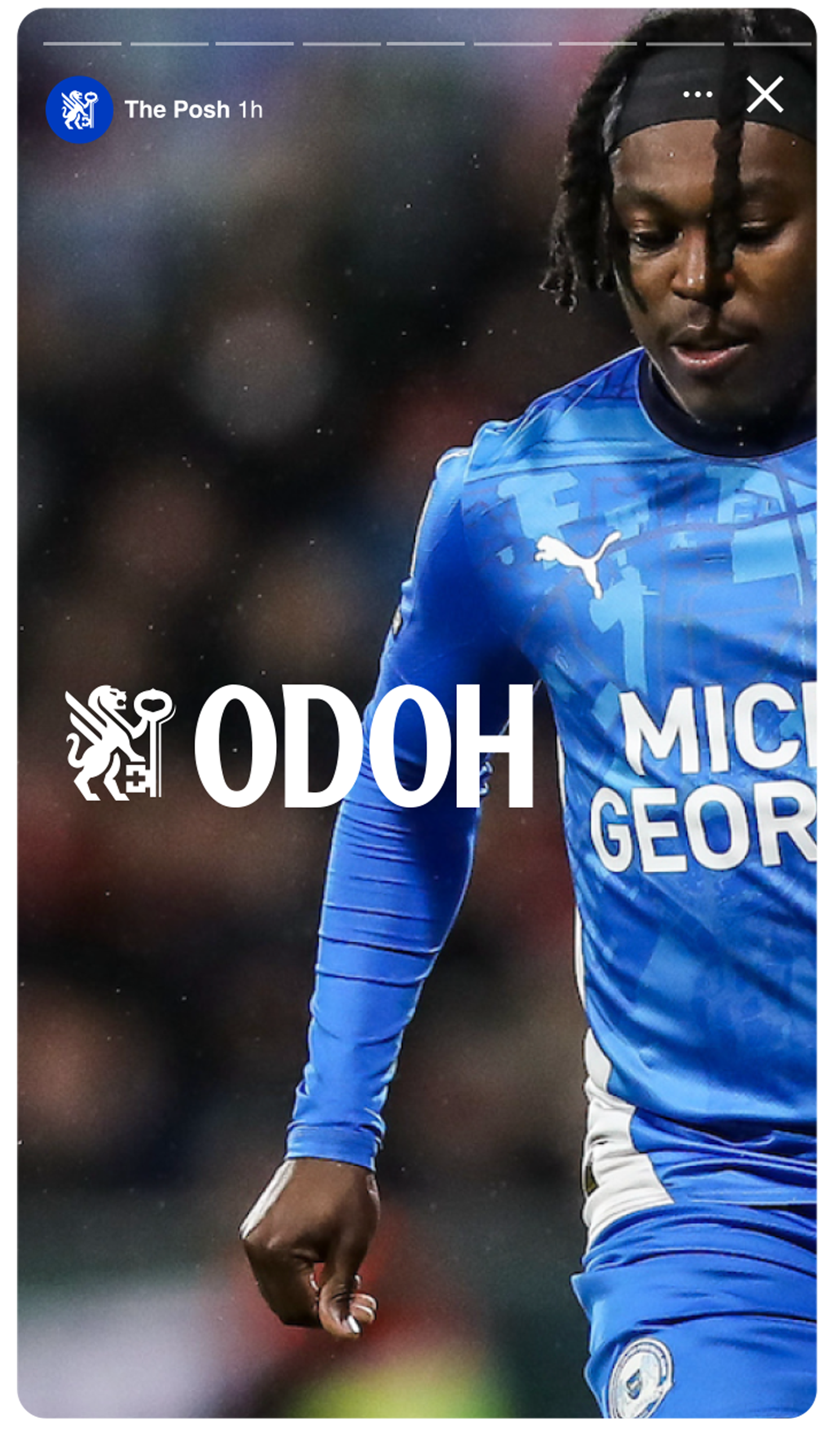
PUBLIC ANNOUNCEMENT
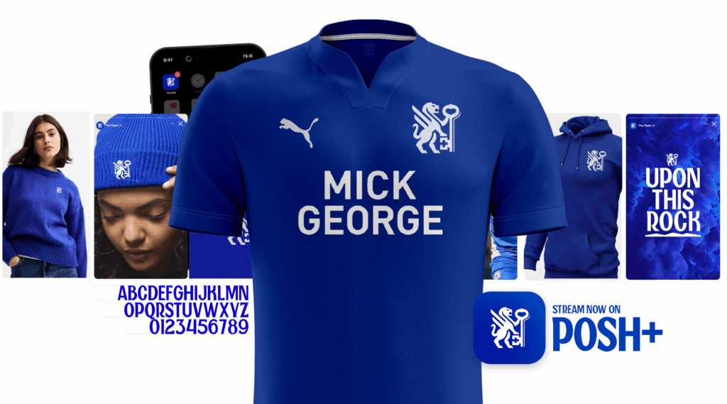
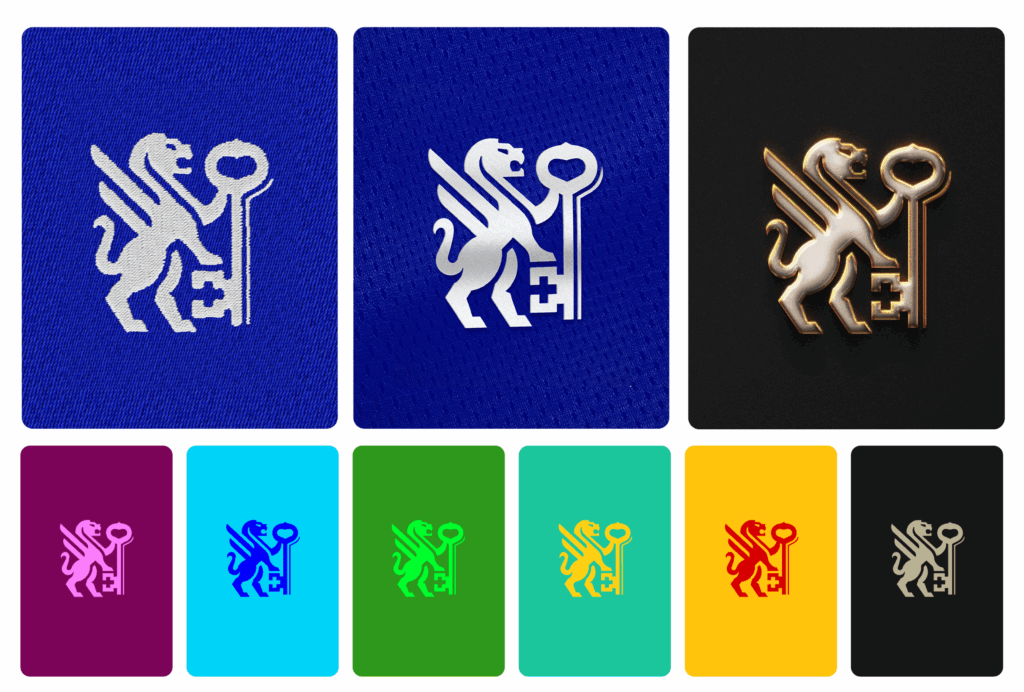
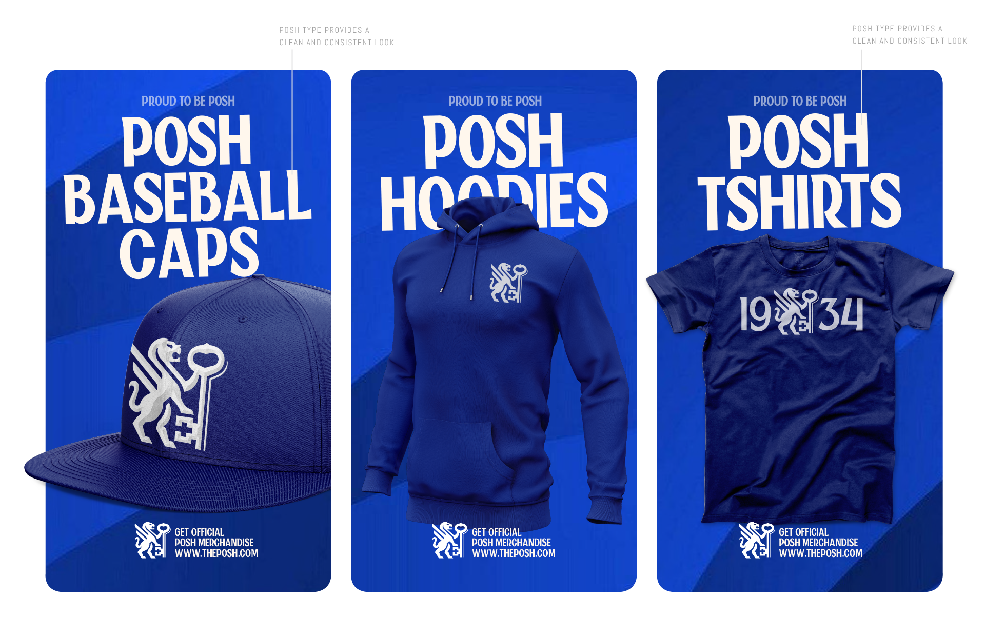
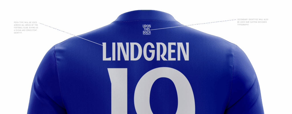
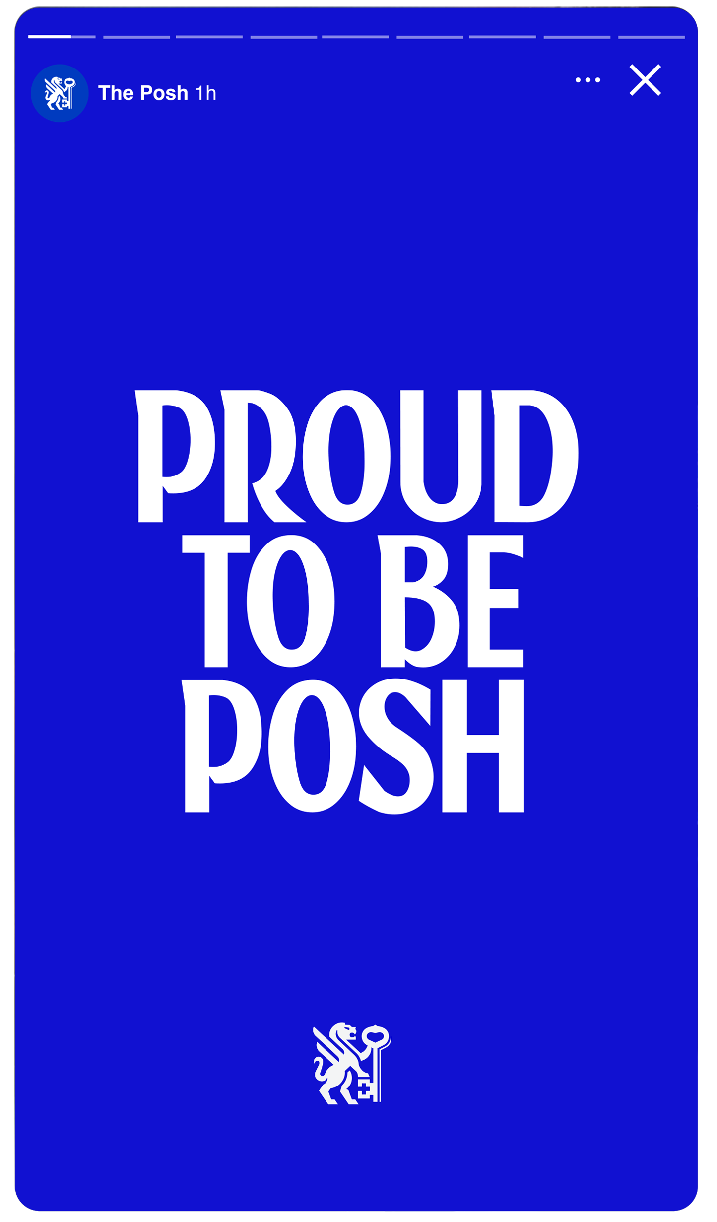
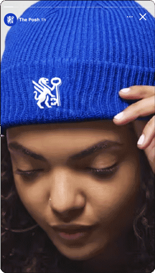
We are proud to reveal our Football Club's new primary identity, secondary identity, custom-designed typography, and series of sub-identities.
Inspired by our history and by our city
Our new identity takes inspiration from our Football Club’s and our city’s history. The winged lions first appeared on our crest in 1965; over the years, these winged lions have taken many forms, inspiring our modern-day crest.
Similarly, keys have also appeared in our Football Club’s crest and the city’s coat of arms. Crossed keys can be found in and around Peterborough, on old city maps and artifacts, as well as on historic buildings, including the Peterborough Town Hall. Supporters told us that keys are a significant symbol of Peterborough.


Modern, stylish and
made for today's world
Our new identity respects the history of the Football Club and the symbolism of Peterborough. We have also created a modern, and stylish design that is suitable for the contemporary world. With our new identity we will stand out as a club that pushes boundaries and offers our supporters best-in-class merchandise and fan wear, enabling our Football Club to look great both on the pitch and in and around the streets of Peterborough.

Adaptable to different
colours and production
techniques
One of the original goals for this project was to create a design that not only looked great and respected the history and traditions of our city and our Football Club, but we also sought to create a new design that is extremely practical and adaptable in multiple scenarios.
Our new identity enables us to adapt to all modern-day printing and production techniques, allowing us to offer better club merchandise and products, as well as accommodate different colour options when needed (for example on future away kits, training gear, and fan lifestyle wear).
We now have a new identity that will help us thrive in the modern world.

A modular
design-system
As part of this process, we needed to create a design-system that was not only stylish and respected the history and traditions of the Football Club, but we also needed to develop an identity that would be modular and adaptable to all scenarios.
Our new identity allows for great flexibility to represent the different names in which we are referred to, and the various functions of the Football Club. For example, our Women’s team, Academy, Foundation, and other functions of the Football Club can be represented consistently and purposefully like never before.

The new identity and modular design system were designed to fit any canvas and adapt to different structures and layouts. This will allow our identity to have greater flexibility and presence wherever it is placed, and it will also enable future business units of the Football Club to integrate seamlessly into this new identity system.

There are countless examples of how this modular design system can flex and scale yet remain consistent and uniquely Posh. Fan favourite destinations, like ‘The Fan Zone’ and ‘The Posh Store,’ can now fit within this design system.

This design system will grow with the Football Club, offering great flexibility and scalability. It will allow us to maintain a consistent look and feel to promote our desire of being the best-in-class across all areas of the Football Club.
Custom designed typography
As part of the brand evolution, we are thrilled to introduce a new custom-designed typeface, exclusively unique to us, which will be used throughout the Football Club. This project has always been more than developing just a new crest; it’s an opportunity to build a consistent, relevant, and meaningful brand identity.
Posh type, designed by crest designer Christopher Payne, is inspired by the style and elegance that our nickname suggests. It is designed to work with the new identity and broader communications pieces. ‘Posh type’ will be implemented in a phased approach during the 2025/26 season and will help us stand out and build consistency across our brand.


Digital
first design
One of the primary goals of this project was to move to a digital-first design. We recognise that the vast majority of interactions that fans have with our Football Club happen digitally, via social media, the Posh App, Posh+, and our website and online store. We set out to create a design that would not only thrive in a traditional context but also thrive in digital spaces.


Being digital-first allows us to have a more expressive, flexible look and feel. We can celebrate the games emotion through striking photography, which complements our new custom design and digital-first crest.
A suite of sub-identities
As part of this project, we set out to highlight and celebrate our Football Club’s unique history and quirks. With this rebrand, we are introducing a series of sub-identities that will provide supporters with more opportunities to represent the Football Club and allow the club to share stories about its history, the city, and its unique identity.
WORDMARK IDENTITY

HERITAGE IDENTITY

MOTTO IDENTITY

PROUD TO BE POSH IDENTITY

MASCOT IDENTITY

POSH WORDMARK IDENTITY

MONOGRAM IDENTITY

TRIUMPH IDENTITIES

Reimagining elements from our current identity
Our new identity reimagines our previous identity by retaining many elements of the previous badge. The winged lions remain, redesigned to feel stronger, more powerful, and functional in today’s modern world.
The city’s keys remain; they are held aloft by the winged lion, creating a strong relationship between the symbolism of the city of Peterborough and the winged lions of the Football Club.
OLD
2008 – MAY 2026

NEW
JUNE 2026 – ONWARDS

From the fans


Frequently Asked Questions
Why is now the right time to create a new identity for the Football Club?
We are always looking for ways to improve the Football Club, both on and off the pitch. From the Posh store to the Matchday experience, we strive to be the best-in-class in all that we do.
Although there is never a great time to announce a project like this as we recognise that it is a sensitive subject, we must always look to move the club forward and live by our values of being best-in-class in all that we do. We have to evolve our identity.
What is wrong with the current crest?
Originally designed in-house in 2008, our current badge has served us well for many years, and it will always be a part of our history. However, with the advent of new technologies and new ways in which fans interact with our Football Club, we realised that the badge was holding us back.
There are multiple practical issues with the current identity, from the complex detailing of the winged lions to contrast issues with the colouring of the design.
We aim to promote ourselves as a modern, forward-thinking Football Club, and the current badge does not reflect that.
How have the fans been involved in this process?
The voices and opinions of the fans have guided this entire project from start to finish.
We have hosted fan forums, requested opinions through two supporter surveys, appeared on fan podcasts discussing the project, and conducted many focus groups, where we shared the design and the ideas behind it.
We have ran a thorough and transparent process, allowing multiple opportunities for fans to offer their constructive input.
Why are we spending money on this when we could be signing new players?
The investment in this project has not been huge, and certainly does not impede us from signing new players.
The designer leading the project, Christopher Payne, took a considerable pay cut to work with the Football Club, driven by his desire to collaborate with Peterborough United and help progress the football club.
Why is the new crest not on this season's kits?
The new crest is not on this season's kits due to manufacturing timelines with our kit suppliers.
Like all football clubs, we must submit our kit designs almost a year in advance of their release.
The new badge will be on the kits for the 2026/27 season.
Who designed the new crest?
Talented designer Christopher Payne designed our new identity and bespoke typography. He has been working closely with the club over the past eight months, spending time in Peterborough and gaining a deep understanding of the local community and the Football Club's vision, values, and personality.

Follow us on social
© 2025 Peterborough United Football Club